COPE Vancouver: The 2022 Municipal Election was a design effort towards the Vancouver Municipal Party COPE Vancouver’s 2022 Campaign. This project ran from May 2022 until election day in October 2022, and was made possible by a strong design and communications team supporting every step along the way.
1968 - Present
The Coalition of Progressive Electors (COPE) is a Vancouver Democratic Socialist Party that was founded in 1968. COPE is guided by the needs of working class people and runs on a platform of vacancy control, safe supply, liveable wages, refunding the community, and true reconciliation.
The promotion of COPE Vancouver in the 2022 Municipal Election sought to present voters with candidate and platform information in order to garner votes. The communication materials focused on who the candidates are and what policies they were promising. The message had to reach as many people as possible around Vancouver, and we boosted awareness of COPE via tens of print materials and a full scale social media campaign.
Scope of Work
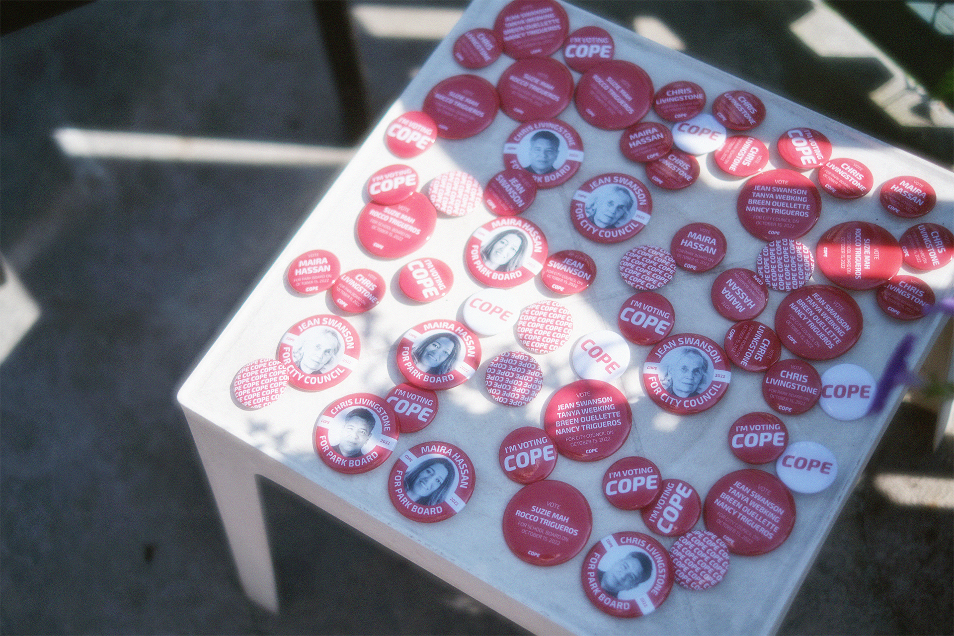
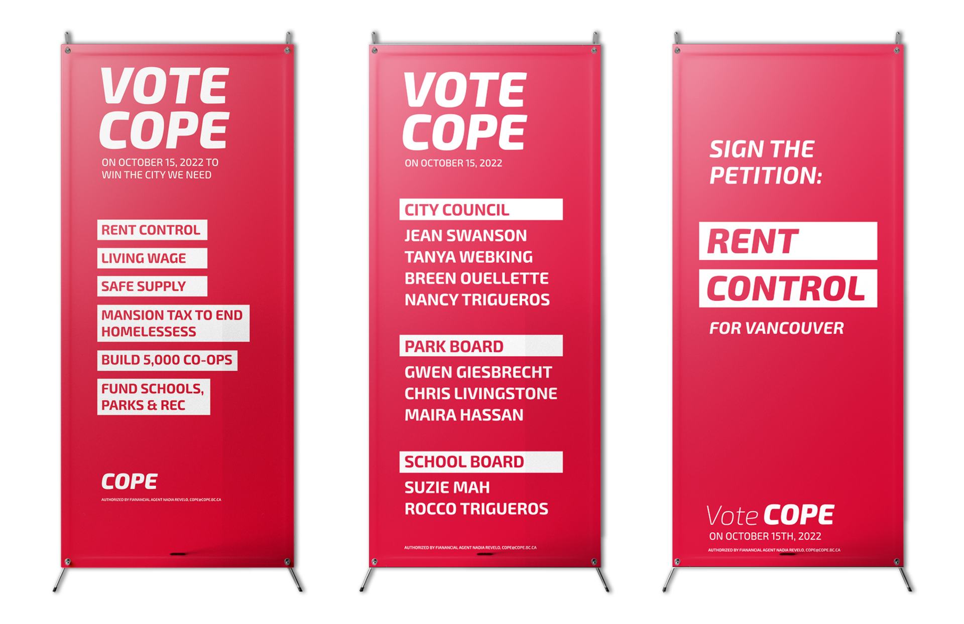
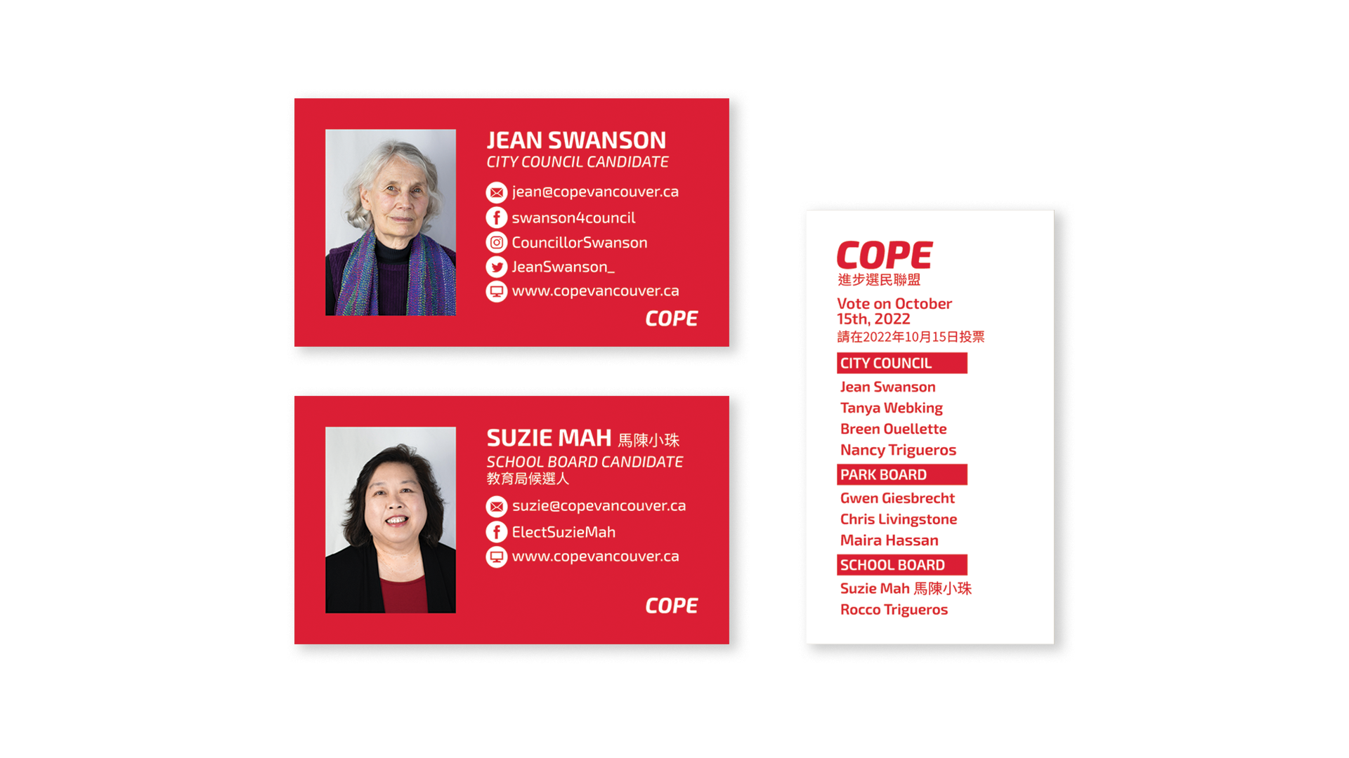
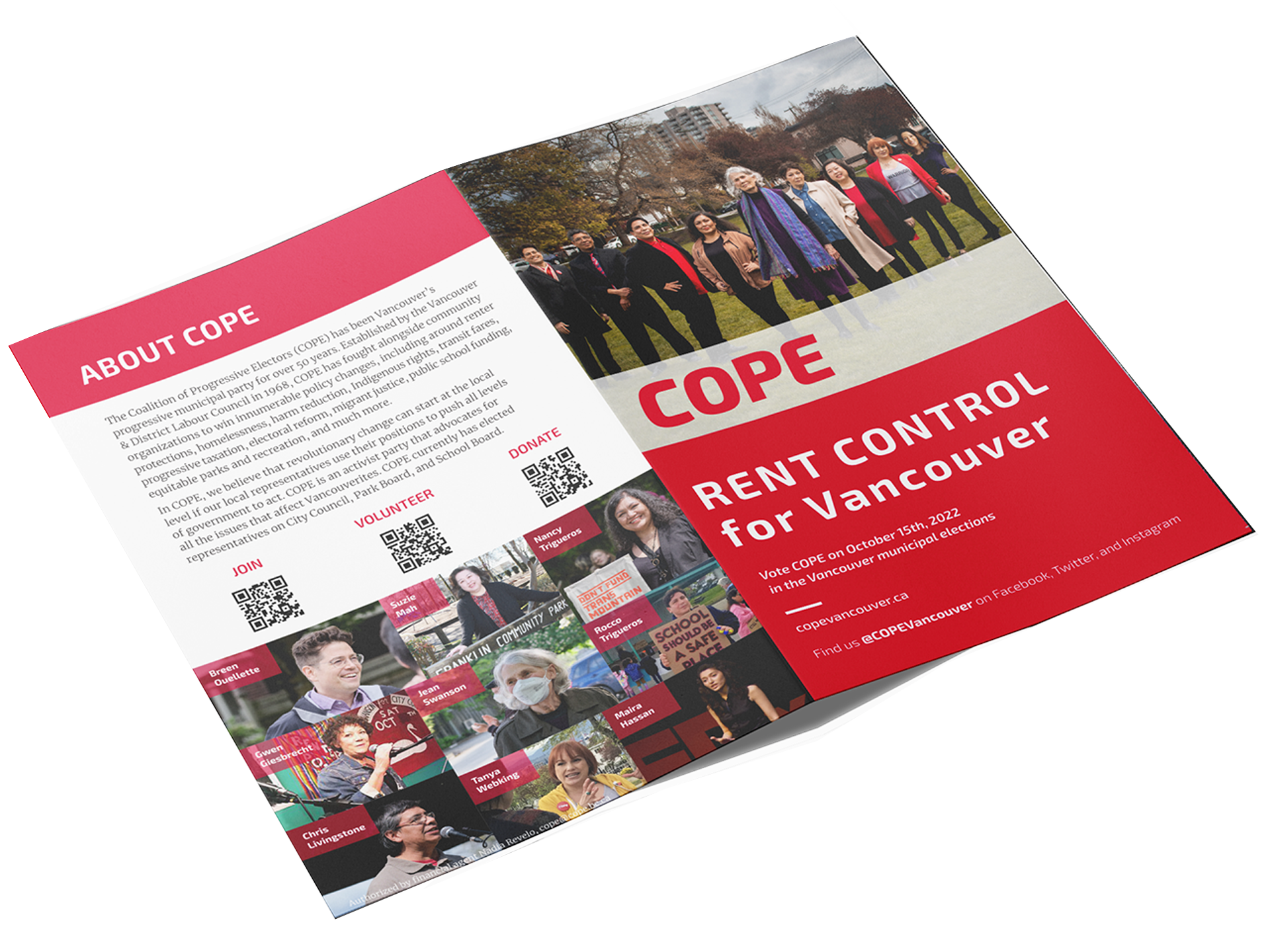
Social Media Plan, Banners, Business Cards, T-Shirts, Buttons, Brochure
Tanya Webking
Indigenous Activist, Mental Health Worker, and 2022 Vancouver City Council Candidate
My association with COPE began when I moved into Vancouver from the surrounding cities in 2021 and I realised I wanted to do something to help make the city a better home for all of its residents. I had a friend who was working for COPE, so after a few hours of grilling him on what it was all about, I was in. Six months and a slough of volunteering duties later, I was asked if I would take on a paid role as a Graphic Designer for the election year. For the next six months, I set out alongside my co-designer to create print materials as well as an entire social media campaign with the goal of reaching voters.
COPE’s goal, as a political party entirely composed of working class people, is to make life in Vancouver easier for those whose lives are often overlooked. The design material had to communicate that the interests of the party reflected the interests of the people. To do this, I focused on highlighting the fact that the members and candidates lived the same lives, worked the same jobs, and had the same interests as the people it was trying to reach. I concluded that I had to use the design to fulfil three tasks: reach the voters, inform the voters who and what exactly they were voting for, and make the voters' concerns feel heard.
We wanted to put the cause right into peoples hands. Print materials are the most classic form of campaign promotion. Right along with word of mouth, buttons flyers, and posters have been used as campaign promotional materials for decades.
Print Material
We began with physical materials. It was my co-designer’s job to create lawn signs and candidate posters, while my tasks included creating hanging and standing banners, business cards, issue based posters, bookmarks, tshirts, an array of campaign buttons, and to collaborate directly on a brochure. COPE already had a set of brand standards and we translated those into a unified slate of branded material that resulted in a refined, professional, unified look for the team during the campaign. These materials were used during canvassing, tabling, in the mail, and at any event COPE was involved in.
Social Media Campaign
During the 2018 election, COPE definitely had a presence on Twitter, but in 2022 I proposed we needed a strong presence on various platforms. My main focus was Instagram. As many young people spend large portions of their day on the platform consuming media and information, this was going to be a good way to grow COPE’s voter base. At the time I began a proposal for the rollout, the Instagram account was being actively used, but lacked uniformity. I had to create a cohesive look that communicated who COPE was and what we were trying to do. My initial content proposal included: Candidate Posts: posts that gave history on each candidates life as an organiser and activist; Issue Based Posts: blurbs on each issue COPE was fighting for, and what they meant; Action Shots: pictures of COPE members and candidates on the ground, fighting for what we believe in; Event Posts: information on where rallies, brunches, info sessions etc. were being held, and Call to Action graphics: calls to volunteer, donate, sign a petition, or anything we wanted the people to be helping us with. It was all accepted so I set forward creating a template for each post type, and when it came time to start posting, we had an expansive set of social media content at the ready.
The Ultimate Goal: Informing Voters
In early October when the election was nearing, it was time to inform people on how to get their vote in. One quality of municipal voting, and voting in general, is that it is not always clear how to cast your vote. Information on voting locations is sparse, ballots are confusing, and it is not common knowledge how the municipal government is structured. Therefore, I created a post with simple, straightforward “Who, What, Where, When, How” information to assist voters.
*Pamphlet co-designed by Elana Mabrito and I
After spending the first few months working on physical materials, my co-designer and I began ideating on a social media plan. Social media provided an opportunity to reach more voters. As a lot of social media users tend to skew younger in age and voters tend to be older, social media was an ideal channel to bridge the gap.
Conclusion
When I was on the precipice of leaving design school, one of my most formative instructors, Michael Cober, asked me what I wanted to do when I entered the field of design post-graduation. All I wanted to do was design for something I care about–something that had meaning for me personally. Receiving the COPE campaign design work right after graduating was like having my goals served to me on a silver platter. Working with a team and having to amalgamate so many different factors, influences, and opinions to create strong, cohesive content was an unforgettable learning experience. During the election, the organization on the social media page reflected that of the party by presenting a unified, professional front. Post-election, I got to hear about people in the community learning about COPE through the content we put out that I had designed, and about people being informed enough to vote for COPE as well.


